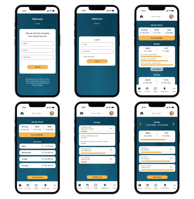
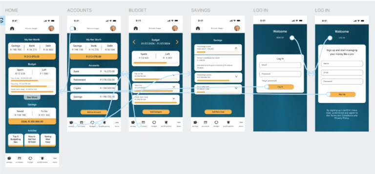
Budgeting and Saving Mobile Application

By Carly Burk

May 2024 – July 2024

Project Overview

The Product

A mobile application to teach users how to save and budget their funds.

The Problem

Saving and budgeting can be an overwhelming task, especially for first time earners. Without a proper foundation of knowledge and experience people create bad financial habits and debt.

The Goal

Teaching first time earners create healthy saving and budgeting habits from the start in an accessible way.

My Role

UX designer leading the app design

Responsibilities:

Conducted the user research and the competitive audit; created the paper and digital wireframe; conducted usability studies; created low fidelity and high fidelity prototypes

Understanding the User

User research

Most of the research I conducted was online, reading articles, and on chat sights.

I assumed the main reason was simply a lack of financial knowledge but I discovered there is a huge emotional aspect to saving and budgeting. That has a large impact on the youth’s mental health and there is a lot of shame around the subject. They also felt overwhelmed by the subject and that there was too much information, it is overwhelming without offering them a way to easily implement it.

I found that young adults who felt knowledgeable and had a budget experienced less negative mental health and worry. Also, those that tracked their spending felt more in control. Even if they didn’t earn as much as their peers.

Pain points

0

Mental health

Many youths feel overwhelmed by inflation, the rising cost of living coupled with lack of financial knowledge leaves them feeling overwhelmed and stuck. Offering a chat space to other users can help them feel less alone in the struggle.

0

Process

Many youths don’t have a good way to track their spending which makes it difficult to budget and leads to overspending. The app should be able to link to their account so it automatically tracks their spending.

0

Knowledge

Young people don’t have the knowledge and experience in managing finances, this is often their first pay check and struggle with paying “adult bills”. We should drip feed the informational content.

0

Putting it into practice

It is challenging to put into practice and make budgeting a habit. We should set reminders and notifications when they are close to their budget. 

Persona - MAGGIE

Age: 21

Education: BA in Graphic Design

Hometown: Johannesburg

Family: Mom, dad, younger sister in high school

Occupation: entry level graphic designer

Goals

To properly manage her funds so she doesn’t need to constantly worry.

Frustrations

She doesn’t have the knowledge of how to budget and feels overwhelmed by the subject.

Living life to the fullest!

Problem statement:

Maggie is a young graphic designer trying to budget her pay check who needs it to be made simply and easy to manage because it is a new and overwhelming task.

Goal statement:

Our app will let users easily input their budget and manage spending  which will affect young adults by saving them time and frustration of not having to do it through trial and error.  We will measure effectiveness by the amount of users that finish setting up a budget.

User journey

The following picture describes the journey map of Kate. The present journey map was defined considering her average experience while buying clothing

ACTION

Look for places to purchase clothes

Choose which clothes to purchase

Add them to her cart and checkout

Pay and get them delivered

Receive items

Review

TASK LIST

Tasks


A. Recognises she needs help budgeting

B. identifies our app as helpful

C. goes onto the site

Tasks


A. determines this site will help her

B. creates a profile

C. Enters her information and verifies her email

Tasks


A. Reads some basic information on budgeting

B. Reads on the importance of saving

C. Watches a short video on how to use the app effectively

Tasks


A. Choose to link her account or manually enter amounts

B. Goes through the process of linking account OR

C. Manually enters her information

Tasks


A. Receives a summary of the information to review

B. Changes any wrong information

C. Sets her budget and savings goals based on the information from the app

Tasks


A. Agrees to be notified if she is close to her spending limit
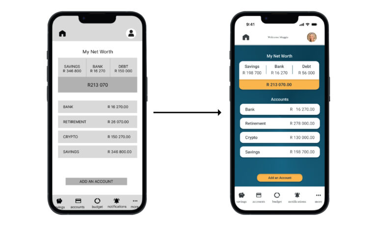
FEELING ADJECTIVE

  • Overwhelmed
  • Intimidated
  • Apprehension
  • Hopeful
  • Empowered
  • Hopeful
  • Overwhelmed
  • Excited
  • Relieved 
  • Hopeful
  • Supported
  • Excited

IMPROVEMENT

OPPORTUNITIES

  • Make the site easy to find and access
  • Keep it simple and accessible
  • Have information auto filled
  • Don’t ask for too much information
  • Keep it simple and quick, only the basic info she needs to understand
  • Make sure she knows it’s secure and private
  • Make it easy to do, everything should automatically recalculate for her
  • It should pop up and she simply needs to agree

Paper wireframes

Next I sketched out the paper wireframes for my app, keeping in mind the navigation and user pain points. I wanted it to be very visual and highlight the products with easy navigation. I want it be be simple and easy to navigate and read all the information as there is a lot of it.

Digital wireframes

Moving from paper to digital wireframes made it easy to understand how the redesign could help address user pain points and improve the user experience. 

Simplifying the information to make it easy to understand and get a concept of the users overall financial situation at a glance was a key part of my strategy.

Low-fidelity prototype

Once the app is downloaded you start on the sign up or log in page, once you have put in your details and verified your information you are taken to the home page. 

From here you can see an overview of your finances, you can navigate to anywhere in the application from the home page.

You can play with it yourself.

Refining the Design

Mockups

I went with a simple design, not wanting to overwhelm the user and focus on the information.

You can change the order on the home page so the main financial goal you are focusing is on the top. 

The main pages and features of the application. 

High-fidelity prototype

My hi-fi prototype followed the same user flow as the lo-fi prototype.

You can play with it yourself.

Accessibility considerations

0

I used a high-contrast colour on buttons and text so that it clearly stands out.

0

The application will have alt text available on each page for smooth screen reader access

0

I used shape and colour to differentiate buttons from the rest of the design clearly, and used clear, simple language to label them. 

Going forward

Takeaways

Impact

the design is easy to navigate, the focus was on making complex information easy to access and understand.

What I learned

I learned the importance of hierarchy in information design, it can quickly get messy. The big takeaway for me is to always come back to the user in your ideation and designing.

Lets connect

Thank you for reviewing my work on the budgeting and saving app! 

If you’d like to see more, or would like to get in touch, my contact information is provided below:

Email: carlym.burk@gmail.com